Infrequently Noted

Alex Russell on browsers, standards, and the process of progress.

Reckoning: Part 3 — Caprock

Development without constraints isn't engineering.

Other posts in the series:

Last time, we looked at how JavaScript-based web development compounded serving errors on US public sector service sites, slowing down access to critical services. These defects are not without injury. The pain of accessing SNAP assistance services in California, Massachusetts, Maryland, Tennessee, New Jersey, and Indiana likely isn't dominated by the shocking performance of their frontends, but their glacial delivery isn't helping.

Waits are a price that developers ask users to pay and loading spinners only buy so much time.

Complexity Perplexity

These SNAP application sites create hurdles to access because the departments procuring them made or green-lit inappropriate architecture choices. In fairness, those choices may have seemed reasonable given JavaScript-based development's capture of the industry.

Betting on JavaScript-based, client-side rendered architectures leads to complex and expensive tools. Judging by the code delivered over the wire, neither CalSAWS nor Deloitte understand those technologies well enough to operate them proficiently.

From long experience and a review of the metrics (pdf) the CalSAWS Joint Management Authority reports, it is plain as day that the level of organisational and cultural sophistication required to deploy a complex JavaScript frontend is missing in Sacramento:

It's safe to assume a version of the same story played out in Annapolis, Nashville, Boston, Trenton, and Indianapolis.

JavaScript-based UIs are fundamentally more challenging to own and operate because the limiting factors on their success are outside the data center and not under the control of procuring teams. The slow, flaky networks and low-end devices that users bring to the party define the envelope of success for client-side rendered UI.

This means that any system that puts JavaScript in the critical path starts at a disadvantage. Not only does JavaScript cost 3x more in processing power, byte-for-byte, than HTML and CSS, but it also removes the browser's ability to parallelise page loading. SPA-oriented stacks also preload much of the functionality needed for future interactions by default. Preventing over-inclusion of ancilliary code generally requires extra effort; work that is not signposted up-front or well-understood in industry.

This, in turn, places hard limits on scalability that arrive much sooner than with HTML-first progressive enhancement.

Consider today's 75-percentile mobile phone[1], a device like the Galaxy A50 or the Nokia G100:

The Nokia G11. It isn't fast, but it also doesn't run up-to-date Android. But for ~$170 (new, unlocked, at launch), you get a better browser than iPhones costing 10x more.

This isn't much of a an improvement on the Moto G4 I recommended for testing in 2016, and it's light years from the top-end of the market today.

1/10th the price, 1/9th the performance.

A device like this presents hard limits on network, RAM, and CPU resources. Because JavaScript is more expensive than HTML and CSS to process, and because SPA architectures frontload script, these devices create a cap on the scalability of SPAs.[2] Any feature that needs to be added once the site's bundle reaches the cap is in tension with every other feature in the site until exotic route-based code-splitting tech is deployed.

JavaScript bundles tend to grow without constraint in the development phase and can easily tip into territory that creates an unacceptable experience for users on slow devices.

Only bad choices remain once a project has reached this state. I have worked with dozens of teams surprised to have found themselves in this ditch. They all feel slightly ashamed because they've been led to believe they're the first; that the technology is working fine for other folks.[3] Except it isn't.

I can almost recite the initial remediation steps in my sleep.[4]

The remaining options are bad for compounding reasons:

These problems don't generally arise in HTML-first, progressively-enhanced experiences because costs are lower at every step in the process:

This model reduces the initial pressure level and keeps the temperature down by limiting the complexity of each page to what's needed.

Teams remediating underperforming JavaScript-based sites often make big initial gains, but the difficulty ramps up once egregious issues are fixed. The residual challenges highlight the higher structural costs of SPA architectures, and must be wrestled down the hard (read: "expensive") way.

Initial successes also create cognitive dissonance within the team. Engineers and managers armed with experience and evidence will begin to compare themselves to competitors and, eventually, question the architecture they adopted. Teams that embark on this journey can (slowly) become masters of their own destinies.

From the plateau of enlightenment, it's simple to look back and acknowledge that for most sites, the pain, chaos, churn, and cost associated with SPA technology stacks are entirely unnecessary. From that vantage point, a team can finally, firmly set policy.

Carrying Capacity

Organisations that purchase and operate technology all have a base carrying capacity. The cumulative experience, training, and OpEx budgets of teams set the level.

Traditional web development presents a model that many organisations have learned to manage. The incremental costs of additional HTML-based frontends are well understood, from authorisation to database capacity to the intricacies of web servers

SPA-oriented frameworks? Not so much.

In practice, the complex interplay of bundlers, client-side routing mechanisms, GraphQL API endpoints, and the need to rebuild monitoring and logging infrastructure creates wholly unowned areas of endemic complexity. This complexity is experienced as a shock to the operational side of the house.

Before, developers deploying new UIs would cabin the complexity and cost within the data center, enabling mature tools to provide visibility. SPAs and client-side rendered UIs invalidate all of these assumptions. A common result is that the operational complexity of SPA-based technologies creates new, additive points of poorly monitored system failure — failures like the ones we have explored in this series.

This is an industry-wide scandal. Promoters of these technologies have not levelled with their customers. Instead, they continue to flog each new iteration as "the future" despite the widespread failure of these models outside sophisticated organisations.

The pitch for SPA-oriented frameworks like React and Angular has always been contingent — we might deliver better experiences if long chains of interactions can be handled faster on the client.

It's time to acknowledge this isn't what is happening. For most organisations building JavaScript-first, the next dollar spent after launch day is likely go towards recovering basic functionality rather than adding new features.

That's no way to run a railroad.

Should This Be An SPA?

Public and private sector teams I consult with regularly experience ambush-by-JavaScript.

This is the predictable result of buying into frontend framework orthodoxy. That creed hinges on the idea that toweringly complex and expensive stacks of client-side JavaScript are necessary to deliver better user experiences.

But this has always been a contingent claim, at least among folks introspective enough to avoid suggesting JS frameworks for every site. Indeed, most web experiences should explicitly avoid both client-side rendered SPA UI and the component systems built to support them. Nearly all sites would be better off opting for progressive enhancement instead.

Doing otherwise is to invite the complexity fox into the OpEx henhouse. Before you know it, you're fighting with "SSR" and "islands" and "hybrid rendering" and "ISR" to get back to the sorts of results a bit of PHP or Ruby and some CSS deliver for a tenth the price.

So how can teams evaluate the appropriateness of SPAs and SPA-inspired frameworks? By revisiting the arguments offered by the early proponents of these approaches.

The entirety of SPA orthodoxy springs from the logic of the Ajax revolution. As a witness to, and early participant in, that movement, I can conclusively assert that the buzz around GMail and Google Maps and many other "Ajax web apps" was their ability to reduce latency for subsequent interactions once an up-front cost had been paid.

The logic of this trade depends, then, on the length of sessions. As we have discussed before, it's not clear that even GMail clears the bar in all cases.

The utility of the next quanta of script is intensely dependent on session depth.
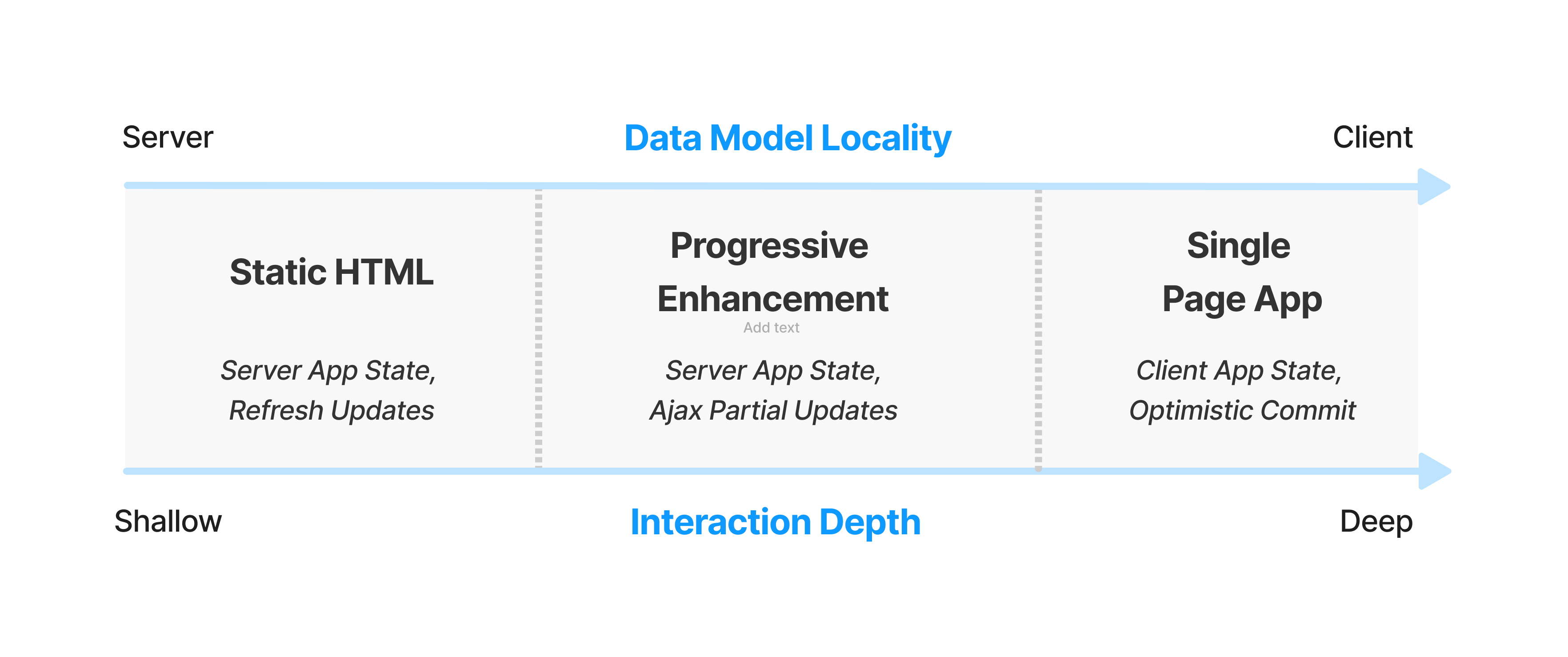
Sites with short average sessions cannot afford much JS up-front.

Very few sites match the criteria for SPA architectures.

Questions managers can use to sort wheat from chaff:

Answering these questions requires understanding critical user journeys. Flows that are most important to a site or project should be written down, and then re-examined through the lens of the marginal networks and devices of the user base.

The rare use-cases that are natural fits for today's JS-first dogma include:

Very few sites should lead with JS-based, framework-centric development.

Teams can be led astray when sites include mutliple apps under a single umberella. The canonical example is WordPress; a blog reading experience for millions and a blog editing UI for dozens. Treating these as independent experiences with their own constraints and tech stacks is more helpful than pretending that they're actually a "single app". This is also the insight behind the "islands architecture", and transfers well to other contexts, assuming the base costs of an experience remain low.

The Pits

DevTools product managers use the phrase "pit of success" to describe how they hope teams experience their tools. The alternative is the (more common) "pit of ignorance".

The primary benefit of progressive enhancement over SPAs and SPA-begotten frameworks is that they leave teams with simpler problems, closer to the metal. Those challenges require attention and focus on the lived experience, which can be remediated cheaply once identified.

The alternative is considerably worse. In a previous post I claimed that:

SPAs are "YOLO" for web development.

This is because an over-reliance on JavaScript moves responsibility for everything into the main thread in the most expensive way.

Predictably, teams whose next PR adds to JS weight rather than HTML and CSS payloads will find themselves in the drink faster, and with tougher path out.

What's gobsmacking is that so many folks have seen these bets go sideways, yet continue to participate in the pantomime of JavaScript framework conformism. These tools aren't delivering except in the breach, but nobody will say so.

And if we were only lighting the bonuses of overpaid bosses on fire through under-delivery, that might be fine. But the JavaScript-industrial-complex is now hurting families in my community trying to access the help they're entitled to.

It's not OK.

Aftermath

Frontend is mired in a practical and ethical tar pit.

Not only are teams paying unexpectedly large premiums to keep the lights on, a decade of increasing JavaScript complexity hasn't even delivered the better user experiences we were promised.

We are not getting better UX for the escalating capital and operational costs. Instead, the results are getting worse for folks on the margins. JavaScript-driven frontend complexity hasn't just driven out the CSS and semantic-markup experts that used to deliver usable experiences for everyone, it is now a magnifier of inequality.

As previously noted, engineering is designing under constraint to develop products that serve users and society. The opposite of engineering is bullshitting, substituting fairy tales for inquiry and evidence.

For the frontend to earn and keep its stripes as an engineering discipline, frontenders need to internalise the envelope of what's possible on most devices.

Then we must take responsibility.

Next: The Way Out.

Thanks to Marco Rogers, and Frances Berriman for their encouragement in making this piece a series and for their thoughtful feedback on drafts.


  1. 3/4 of all devices are faster than this phone, which means 1/4 of phones are slower. Teams doing serious performance work tend to focus on even higher percentiles (P90, P95, etc.).

    The Nokia G100 is by no means a hard target. Teams aspiring to excellence should look further down the price and age curves for representative compute power. Phones with 28nm-fabbed A53 cores are still out there in volume. ↩︎

  2. One response to the regressive performance of the sites enumerated here is a version of "they're just holding it wrong; everybody knows you should use Server-Side Rendering (SSR) to paint content quickly".

    Ignoring the factual inaccuracies undergirding SPA apologetics[5], the promised approaches ("SSR + hydration", "concurrent mode", etc.) have not worked.

    We can definitively see they haven't worked because the arrival of INP has shocked the body politic. INP has created a disturbance in the JS ecosystem because, for the first time, it sets a price on main-thread excesses backed by real-world data.

    Teams that adopt all these techniques are still are not achieving minimally good results. This is likely why "React Server Components" exists; it represents a last-ditch effort to smuggle some of the most costly aspects of the SPA-based tech stack back to the server where it always belonged.

    At the risk of tedious repetition, what these INP numbers mean is that these are bad experiences for real users. And these bad experiences can be laid directly at the feet of tools and architectures that promised better experiences.

    Putting the lie to SPA theatrics doesn't require inventing a new, more objective value system. The only petard needed to hoist the React ecosystem into the stratosphere is its own sales pitch, which it has miserably and consistently failed to achieve in practice. ↩︎

  3. The JavaScript community's omertà regarding the consistent failure of frontend frameworks to deliver reasonable results at acceptable cost is likely to be remembered as one of the most shameful aspects of frontend's lost decade.

    Had the risks been prominently signposted, dozens of teams I've worked with personally could have avoided months of painful remediation, and hundreds more sites I've traced could have avoided material revenue losses.

    Too many engineering leaders have found their teams beached and unproductive for no reason other than the JavaScript community's dedication to a marketing-over-results ethos of toxic positivity.

    Shockingly, cheerleaders for this pattern of failure have not recanted, even when confronted with the consequences. They are not trustworthy. An ethical frontend practice will never arise from this pit of lies and half-truths. New leaders who reject these excesses are needed, and I look forward to supporting their efforts. ↩︎

  4. The first steps in remediating JS-based performance disasters are always the same:

    • Audit server configurations, including:
      • Check caching headers and server compression configurations.
      • Enable HTTP/2 (if not already enabled).
      • Removing extraneous critical-path connections, e.g. by serving assets from the primary rather than a CDN host.
    • Audit the contents of the main bundle and remove unneeded or under-used dependencies.
    • Implement code-splitting and dynamic imports.
    • Set bundle size budgets and implement CI/CD enforcement.
    • Form a group of senior engineers to act as a "latency council".
      • Require the group meet regularly to review key performance metrics.
      • Charter them to approve all changes that will impact latency.
      • Have them institute an actionable "IOU" system for short-term latency regression.
      • Require their collective input when drafting or grading OKRs.
    • Beg, borrow, or steal buy low-end devices for all product managers and follow up to ensure they're using them regularly.

    There's always more to explore. SpeedCurve's Performance Guide and WebPageTest.org's free course make good next steps. ↩︎

  5. Apologists for SPA architectures tend to trot out arguments with the form "nobody does X any more" or "everybody knows not to do Y" when facing concrete evidence that sites with active maintenance are doing exactly the things they have recently dissavowed, proving instead that not only are wells uncapped, but the oil slicks aren't even boomed.

    It has never been true that in-group disfavour fully contains the spread of once-popular techniques. For chrissake, just look at the CSS-in-JS delusion! This anti-pattern appears in a huge fraction of the traces I look at from new projects today, and that fraction has only gone up since FB hipsters (who were warned directly by browser engineers that it was a terrible idea) finally declared it a terrible idea.

    Almost none of today's regretted projects carry disclaimers. None of the frameworks that have led to consistent disasters have posted warnings about their appropriate use. Few boosters for these technologies even outline what they had to do to stop the bleeding (and there is always bleeding) after adopting these complex, expensive, and slow architectures.

    Instead, teams are supposed to have followed every twist and turn of inscurtable faddism, spending effort to upgrade huge codebases whenever the new hotness changes.

    Of course, when you point out that this is what the apologists are saying, no-true-Scotsmanship unfurls like clockwork.

    It's irresponsibility theatre.

    Consulting with more than a hundred teams over the past eight years has given me ring-side season tickets to the touring production of this play. The first few performances contained frission, some mystery...but now it's all played out. There's no paradox — the lies by omission are fully revealed, and the workmanlike retelling by each new understudy is as charmless as the last.

    All that's left is to pen scathing reviews in the hopes that the tour closes for good. ↩︎

Reckoning: Part 2 — Object Lesson

What hath we wrought? A case study.

Other posts in the series:

The Golden Wait

BenefitsCal is the state of California's recently developed portal for families that need to access SNAP benefits (née "food stamps"):[1]


BenefitsCal loading on a low-end device over a 9Mbps link with 170ms RTT latency via WebPageTest.org

Code for America's getcalfresh.org performs substantially the same function, providing a cleaner, faster, and easier-to-use alternative to California county and state benefits applications systems:


getcalfresh.org loading under the same conditions

The like-for-like, same-state comparison getcalfresh.org provides is unique. Few public sector services in the US have competing interfaces, and only Code for America was motivated to build one for SNAP applications.

getcalfresh.org finishes in 1/3 the time, becoming interactive not long after the BenefitsCal loading screen appears.

WebPageTest.org timelines document a painful progression. Users can begin to interact with getcalfresh.org before the first (of three) BenefitsCal loading screens finish (scroll right to advance):


Google's Core Web Vitals data backs up test bench assessments. Real-world users are having a challenging time accessing the site:

BenefitsCal is a poor experience on real phones.

But wait! There's more. It's even worse than it looks.

The multi-loading-screen structure of BenefitsCal fakes out Chrome's heuristic for when to record Largest Contentful Paint.

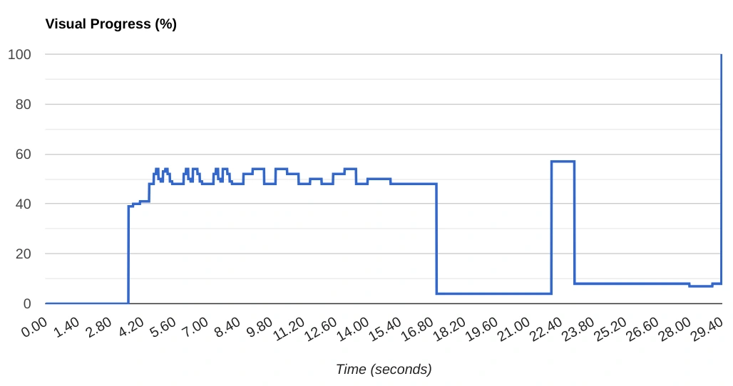
On low-end devices, BenefitsCal appears to <em>almost</em> load at the 22 second mark, only to put up a second loading screen shortly after. Because this takes so long, Chromium's heuristics for Largest Contentful Paint are thrown off, incorrectly reporting the end of the first loading screen as the complete page.
On low-end devices, BenefitsCal appears to almost load at the 22 second mark, only to put up a second loading screen shortly after. Because this takes so long, Chromium's heuristics for Largest Contentful Paint are thrown off, incorrectly reporting the end of the first loading screen as the complete page.

The real-world experience is significantly worse than public CWV metrics suggest.

Getcalfresh.org uses a simpler, progressively enhanced, HTML-first architecture to deliver the same account and benefits signup process, driving nearly half of all signups for California benefits (per CalSAWS).

The results are night-and-day:[2]

getcalfresh.org generates almost half of the new filings to the CalSAWS system. Its relative usability presumably contributes to that success.

And this is after the state spent a million dollars on work to achieve "GCF parity".

The Truth Is In The Trace

No failure this complete has a single father. It's easy to enumerate contributing factors from the WebPageTest.org trace, and a summary of the site's composition and caching make for a bracing read:

File Type First View Repeat View
Wire (KB) Disk Ratio Wire Disk Ratio Cached
JavaScript 17,435 25,865 1.5 15,950 16,754 1.1 9%
Other (text) 1,341 1,341 1.0 1,337 1,337 1.0 1%
CSS 908 908 1.0 844 844 1.0 7%
Font 883 883 N/A 832 832 N/A 0%
Image 176 176 N/A 161 161 N/A 9%
HTML 6 7 1.1 4 4 1.0 N/A
Total 20,263 29,438 1.45 18,680 19,099 1.02 7%

The first problem is that this site relies on 25 megabytes of JavaScript (uncompressed, 17.4 MB on over the wire) and loads all of it before presenting any content to users. This would be unusably slow for many, even if served well. Users on connections worse than the P75 baseline emulated here experience excruciating wait times. This much script also increases the likelihood of tab crashes on low-end devices.[3]

Very little of this code is actually used on the home page, and loading the home page is presumably the most common thing users of the site do:[4]

Red is bad. DevTools shows less than a quarter of the JavaScript downloaded is executed.

As bad as that is, the wait to interact at all is made substantially worse by inept server configuration. Industry-standard gzip compression generally results in 4:1-8:1 data savings for text resources (HTML, CSS, JavaScript, and "other") depending on file size and contents. That would reduce ~28 megabytes of text, currently served in 19MB of partially compressed resources, to between 3.5MB and 7MB.

But compression is not enabled for most assets, subjecting users to wait for 19MB of content. If CalSAWS built BenefitsCal using progressive enhancement, early HTML and CSS would become interactive while JavaScript filigrees loaded in the background. No such luck for BenefitsCal users on slow connections.

For as bad as cell and land-line internet service are in dense California metros, the vast rural population experiences large areas with even less coverage.

Thanks to the site's JavaScript-dependent, client-side rendered, single-page-app (SPA) architecture, nothing is usable until nearly the entire payload is downloaded and run, defeating built-in browser mitigations for slow pages. Had progressive enhancement been employed, even egregious server misconfigurations would have had a muted effect by comparison.[5]

Zip It

Gzip compression has been industry standard on the web for more than 15 years, and more aggressive algorithms are now available. All popular web servers support compression, and some enable it by default. It's so common that nearly every web performance testing tool checks for it, including Google's PageSpeed Insights.[6]

Gzip would have reduced the largest script from 2.1MB to a comparatively svelte 340K; a 6.3x compression ratio:

$ gzip -k main.2fcf663c.js 
$ ls -l
> total 2.5M
> ... 2.1M Aug 1 17:47 main.2fcf663c.js
> ... 340K Aug 1 17:47 main.2fcf663c.js.gz

Not only does the site require a gobsmacking amount of data on first visit, it taxes users nearly the same amount every time they return.

Because most of the site's payload is static, the fraction cached between first and repeat views should be near 100%. BenefitsCal achieves just 7%.

This isn't just perverse; it's so far out of the norm that I struggled to understand how CalSAWS managed to so thoroughly misconfigure a web server modern enough to support HTTP/2.

The answer? Overlooked turnkey caching options in CloudFront's dashboard.[7]

This oversight might have been understandable at launch. The mystery remains how it persisted for nearly three years (pdf). The slower the device and network, the more sluggish the site feels. Unlike backend slowness, the effects of ambush-by-JavaScript can remain obscured by the fast phones and computers used by managers and developers.

But even if CalSAWS staff never leave the privilege bubble, there has been plenty of feedback:

A Reddit user responding to product-level concerns with: <br><em>'And it's so f'n slow.'</em>
A Reddit user responding to product-level concerns with:
'And it's so f'n slow.'

Having placed a bet on client-side rendering, CalSAWS, Gainwell, and Deloitte staff needed to add additional testing and monitoring to assess the site as customers experience it. This obviously did not happen.

The most generous assumption is they were not prepared to manage the downsides of the complex and expensive JavaScript-based architecture they chose over progressive enhancement.[8][9]

Near Peers

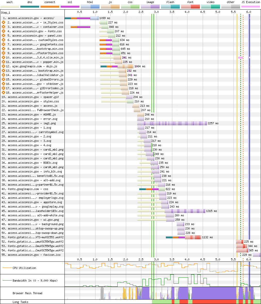
Analogous sites from other states point the way. For instance, Wisconsin's ACCESS system:

Six seconds isn't setting records, but it's a fifth as long as it takes to access BenefitsCal.

There's a lot that could be improved about WI ACCESS's performance. Fonts are loaded too late, and some of the images are too large. They could benefit from modern formats like WebP or AVIF. JavaScript could be delay-loaded and served from the same origin to reduce connection setup costs. HTTP/2 would left-shift many of the early resources fetched in this trace.

WI ACCESS harks from simpler times.

But the experience isn't on fire, listing, and taking on water.

Despite numerous opportunities for improvement, WI ACCESS's appropriate architecture keeps the site usable for all.

Because the site is built in a progressively enhanced way, simple fixes can cheaply and quickly improve on an acceptable baseline.

Even today's "slow" networks and phones are so fast that sites can commit almost every kind of classic error and still deliver usable experiences. Sites like WI ACCESS would have felt sluggish just 5 years ago but work fine today. It takes extra effort to screw up as badly as BenefitsCal has.

Blimey

To get a sense of what's truly possible, we can compare a similar service from the world leader in accessible, humane digital public services: gov.uk, a.k.a., the UK Government Digital Service (GDS).

gov.uk's Universal Credit page finishes loading before BenefitsCal's first loading screen even starts.

California enjoys a larger GDP and a reputation for technology excellence, and yet the UK consistently outperforms the Golden State's public services.

There are layered reasons for the UK's success:

The BenefitsCal omnishambles should trigger a fundamental rethink. Instead, the prime contractors have just been awarded another $1.3BN over a long time horizon. CalSAWS is now locked in an exclusive arrangement with the very folks that broke the site with JavaScript. Any attempt at fixing it now looks set to reward easily-avoided failure.

Too-big-to-fail procurement isn't just flourishing in California; it's thriving across public benefits application projects nationwide. No matter how badly service delivery is bungled, the money keeps flowing.

JavaScript Masshattery

CalSAWS is by no means alone.

For years, I have been documenting the inequality exacerbating effects of JS-based frontend development based on the parade of private-sector failures that cross my desk.[11]

Over the past decade, those failures have not elicited a change in tone or behaviour from advocates for frameworks, but that might be starting to change, at least for high-traffic commercial sites.

Core Web Vitals is creating pressure on slow sites that value search engine traffic. It's less clear what effect it will have on public-sector monopsonies. The spread of unsafe-at-any-scale JavaScript frameworks into government is worrying as it's hard to imagine what will dislodge them. There's no comparison shopping for food stamps.[12]

The Massachusetts Executive Office of Health and Human Services (EOHHS) seems to have fallen for JavaScript marketing hook, line, and sinker.

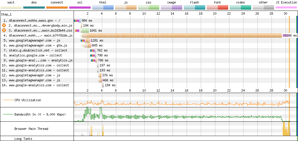
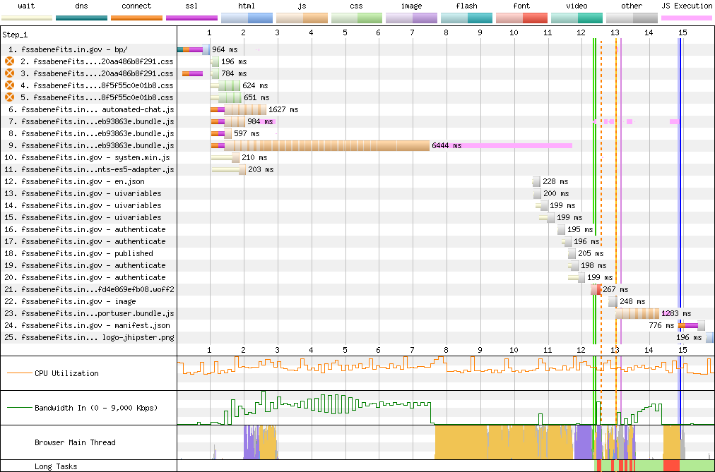
DTA Connect is the result, a site so slow that it frequently takes me multiple attempts to load it from a Core i7 laptop attached to a gigabit network.

From the sort of device a smartphone-dependent mom might use to access the site? It's lookin' slow.


Introducing the Can You Hold Your Breath Longer Than It Takes to Load DTA Connect? Challenge.

I took this trace multiple times, as WebPageTest.org kept timing out. It's highly unusual for a site to take this long to load. Even tools explicitly designed to emulate low-end devices and networks needed coaxing to cope.

The underlying problem is by now familiar:

You don't have to be a web performance expert to understand that <a href='https://www.webpagetest.org/breakdown.php?test=240804_AiDcFG_31Y&run=1&end=visual'>10.2MB of JS</a> is a tad much, particularly when it is served without compression.
You don't have to be a web performance expert to understand that 10.2MB of JS is a tad much, particularly when it is served without compression.

Vexingly, whatever hosting infrastructure Massachusetts uses for this project throttles serving to 750KB/s. This bandwidth restriction combines with server misconfigurations to ensure the site takes forever to load, even on fast machines.[13]

It's a small mercy that DTA Connect sets caching headers, allowing repeat visits to load in "only" several seconds. Because of the SPA architecture, nothing renders until all the JavaScript gathers its thoughts at the speed of the local CPU.

The slower the device, the longer it takes.[14]

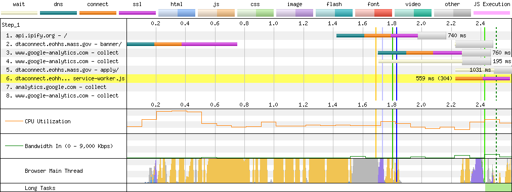
Even when everything is cached, DTA Connect takes multiple seconds to load on a low-end device owing to the time it takes to run this much JavaScript (yellow and grey in the 'Browser main thread' row).

A page this simple, served entirely from cache, should render in much less than a second on a device like this.[15]

Maryland Enters The Chat

The correlation between states procuring extremely complex, newfangled JavaScript web apps and fumbling basic web serving is surprisingly high.

Case in point, the residents of Maryland wait seconds on a slow connection for megabytes of uncompressed JavaScript, thanks to the Angular 9-based SPA architecture of myMDTHINK.[16]

Maryland's myMDTHINK loads its <a href='https://www.webpagetest.org/breakdown.php?test=240805_BiDc66_389&run=1&end=visual'>5.2MB critical-path JS</a> bundle sans gzip.
Maryland's myMDTHINK loads its 5.2MB critical-path JS bundle sans gzip.

American legislators like to means test public services. In that spirit, perhaps browsers should decline to load multiple megabytes of JavaScript if a site can't manage gzip.

Chattanooga Chug Chug

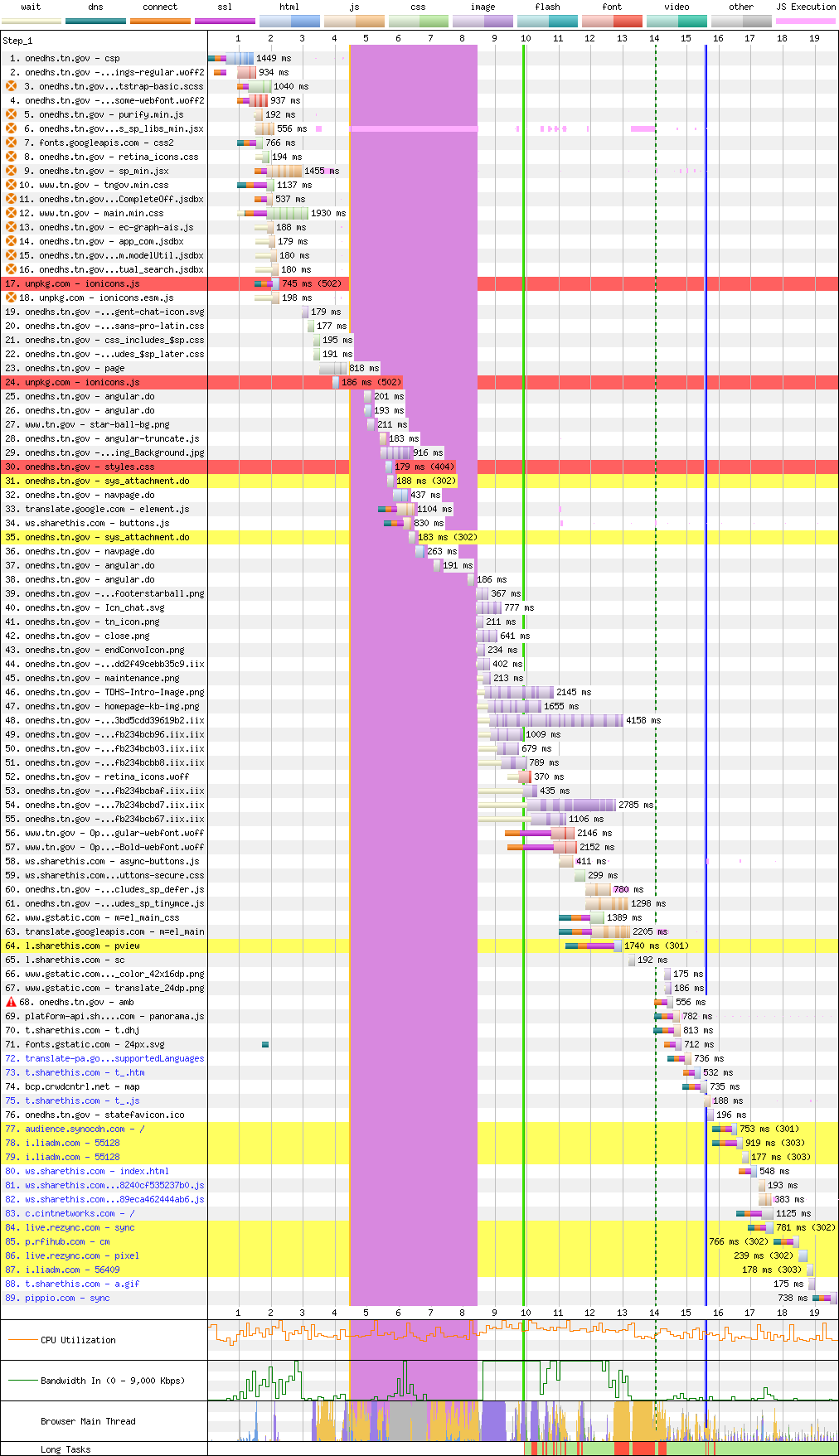
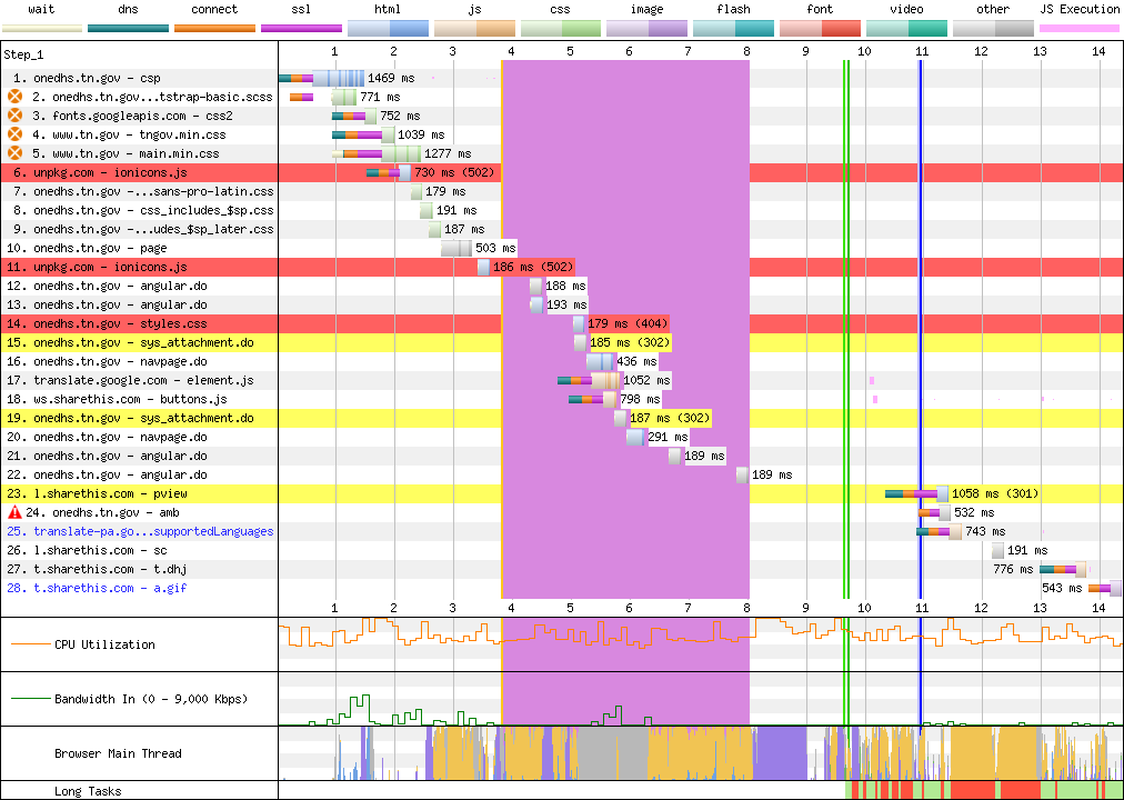
Tennessee, a state with higher-than-average child poverty, is at least using JavaScript to degrade the accessibility of its public services in unique ways.

Instead of misconfiguring web servers, The Volunteer State uses Angular to synchronously fetch JSON files that define the eventual UI in an onload event handler.

The enormous purple line represents four full seconds of main thread unresponsiveness.
It's little better on second visit, owing to the CPU-bound nature of the problem.

Needless to say, this does not read to the trained eye as competent work.

SNAP? In Jersey? Fuhgeddaboudit

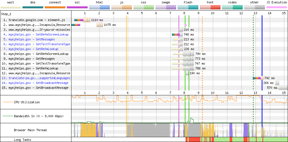
New Jersey's MyNJHelps.gov (yes, that's the actual name) mixes the old-timey slowness of multiple 4.5MB background stock photos with a nu-skool render-blocking Angular SPA payload that's 2.2MB on the wire (15.7MB unzipped), leading to first load times north of 20 seconds.

Despite serving the oversized JavaScript payload relatively well, the script itself is so slow that repeat visits take nearly 13 seconds to display fully:


What Qualcomm giveth, Angular taketh away.

Despite almost perfect caching, repeat visits take more than 10 seconds to render thanks to a slow JavaScript payload.

Debugging the pathologies of this specific page are beyond the scope of this post, but it is a mystery how New Jersey managed to deploy an application that triggers a debugger; statement on every page load with DevTools open whilst also serving a 1.8MB (13.8MB unzipped) vendor.js file with no minification of any sort.

One wonders if anyone involved in the deployment of this site are developers, and if not, how it exists.

Hoosier Hospitality

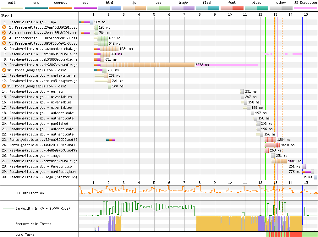
Nearly half of the 15 seconds required to load Indiana's FSSA Benefits Portal is consumed by a mountain of main-thread time burned in its 4.2MB (16MB unzipped) Angular 8 SPA bundle.

Combined with a failure to set appropriate caching headers, both timelines look identically terrible:


Can you spot the difference?

First view.
First view.
Repeat visit.
Repeat visit.

Deep Breaths

The good news is that not every digital US public benefits portal has been so thoroughly degraded by JavaScript frameworks. Code for America's 2023 Benefits Enrollment Field Guide study helpfully ran numbers on many benefits portals, and a spot check shows that those that looked fine last year are generally in decent shape today.

Still, considering just the states examined in this post, one in five US residents will hit underperforming services, should they need them.

None of these sites need to be user hostile. All of them would be significantly faster if states abandoned client-side rendering, along with the legacy JavaScript frameworks (React, Angular, etc.) built to enable the SPA model.

GetCalFresh, Wisconsin, and the UK demonstrate a better future is possible today. To deliver that better future and make it stick, organisations need to learn the limits of their carrying capacity for complexity. They also need to study how different architectures fail in order to select solutions that degrade more gracefully.

Next: Caprock: Development without constraints isn't engineering.

Thanks to Marco Rogers, and Frances Berriman for their encouragement in making this piece a series and for their thoughtful feedback on drafts.

If you work on a site discussed in this post, I offer (free) consulting to public sector services. Please get in touch.


  1. The JavaScript required to render anything on BenefitsCal embodies nearly every anti-pattern popularised (sometimes inadvertently, but no less predictably) by JavaScript influencers over the past decade, along with the most common pathologies of NPM-based frontend development.

    A perusal of the code reveals:

    • Multiple reactive frontend frameworks, namely React, Vue, and RxJS.
    • "Client-side routing" metadata for the entire site bundled into the main script.
    • React components for all UI surfaces across the entire site, including:
    • A so-called "CSS-in-JS" library that does not support compilation to an external stylesheet. This is categorically the slowest and least efficient way to style web-based UIs. On its own, it would justify remediation work.
    • Unnecessary polyfills and transpilation overhead, including:
      • class syntax transpilation.
      • Generator function transpilation and polyfills independently added to dozens of files.
      • Iterator transpilation and polyfills.
      • Standard library polyfills, including obsolete userland implementations of ArrayBuffer, Object.assign() and repeated inlining of polyfills for many others, including a litany of outdated TypeScript-generated polyfills, bloating every file.
      • Obselete DOM polyfills, including a copy of Sizzle to provide emulation for document.querySelectorAll() and a sizable colourspace conversion system, along with userland easing functions for all animations supported natively by modern CSS.
    • No fewer than 2...wait...5...no, 6 large — seemingly different! — User-Agent parsing libraries that support browsers as weird and wonderful as WebOS, Obigo, and iCab. What a delightful and unexpected blast from the past! (pdf)
    • What appears to be an HTML parser and userland DOM implementation!?!
    • A full copy of Underscore.
    • A full copy of Lodash.
    • A full copy of core-js.
    • A userland elliptic-curve cryptography implementation. Part of an on-page chatbot, naturally.
    • A full copy of Moment.js. in addition to the custom date and time parsing functions already added via bundling of the (overlarge) react-date-picker library.
    • An unnecessary OAuth library.
    • An emulated version of the Node.js buffer class, entirely redundant on modern browsers.
    • The entire Amazon Chime SDK, which includes all the code needed to do videoconferencing. This is loaded in the critical path and alone adds multiple megabytes of JS spread across dozens of webpack-chunked files. No features of the home page appear to trigger videoconferencing.
    • A full copy of the AWS JavaScript SDK, weighing 2.6MB, served separately.
    • Obviously, nothing this broken would be complete without a Service Worker that only caches image files.

    This is, to use the technical term, whack.

    The users of BenefitsCal are folks on the margins — often working families — trying to feed, clothe, and find healthcare for kids they want to give a better life. I can think of few groups that would be more poorly served by such baffling product and engineering mismanagement. ↩︎ ↩︎

  2. getcalfresh.org isn't perfect from a performance standpoint.

    The site would feel considerably snappier if the heavy chat widget it embeds were loaded on demand with the facade pattern and if the Google Tag Manager bundle were audited to cut cruft. ↩︎

  3. Browser engineers sweat the low end because that's where users are[17], and when we do a good job for them, it generally translates into better experiences for everyone else too. One of the most durable lessons of that focus has been that users having a bad time in one dimension are much more likely to be experiencing slowness in others.

    Slow networks correlate heavily with older devices that have less RAM, slower disks, and higher taxes from "potentially unwanted software" (PUS). These machines may experience malware fighting with invasive antivirus, slowing disk operations to a crawl. Others may suffer from background tasks for app and OS updates that feel fast on newer machines but which drag on for hours, stealing resources from the user's real work the whole time.

    Correlated badness also means that users in these situations benefit from any part of the system using fewer resources. Because browsers are dynamic systems, reduced RAM consumption can make the system faster, both through reduced CPU load from zram, as well as rebalancing in auto-tuning algorithms to optimise for speed rather than space.

    The pursuit of excellent experiences at the margins is deep teacher about the systems we program, and a frequently humbling experience. If you want to become a better programmer or product manager, I recommend focusing on those cases. You'll always learn something. ↩︎

  4. It's not surprising to see low code coverage percentages on the first load of an SPA. What's shocking is that the developers of BenefitsCal confused it with a site that could benefit from this architecture.

    To recap: the bet that SPA-oriented JavaScript frameworks make is that it's possible to deliver better experiences for users when the latency of going to the server can be shortcut by client-side JavaScript.

    I cannot stress this enough: the premise of this entire wing of web development practice is that expensive, complex, hard-to-operate, and wicked-to-maintain JavaScript-based UIs lead to better user experiences.

    It is more than fair to ask: do they?

    In the case of BenefitsCal and DTA Connect, the answer is "no".

    The contingent claim of potentially improved UI requires dividing any additional up-front latency by the number of interactions, then subtracting the average improvement-per-interaction from that total. It's almost impossible to imagine any app with sessions long enough to make 30-second up-front waits worthwhile, never mind a benefits application form.

    These projects should never have allowed "frontend frameworks" within a mile of their git repos. That they both picked React (a system with a lurid history of congenital failure) is not surprising, but it is dispiriting.

    Previous posts here have noted that site structure and critical user journeys largely constrain which architectures make sense:

    Sites with shorter average sessions can afford less JS up-front.
    Sites with short average sessions cannot afford much JS up-front.

    These portals serve many functions: education, account management, benefits signup, and status checks. None of these functions exhibit the sorts of 50+ interaction sessions of a lived-in document editor (Word, Figma) or email client (Gmail, Outlook). They are not "toothbrush" services that folks go to every day, or which they use over long sessions.

    Even the sections that might benefit from additional client-side assistance (rich form validation, e.g.) cannot justify loading all of that code up-front for all users.

    The failure to recognise how inappropriate JavaScript-based SPA architectures are for most sites is an industry-wide scandal. In the case of these services, that scandal takes on whole new dimension of reckless irresponsibility. ↩︎

  5. JavaScript-based SPAs yank the reins away from the browser while simultaneously frontloading code at the most expensive time.

    SPA architectures and the frameworks built to support them put total responsibility for all aspects of site performance squarely on the shoulders of the developer. Site owners who are even occasionally less than omniscient can quickly end up in trouble. It's no wonder many teams I work with are astonished at how quickly these tools lead to disastrous results.

    SPAs are "YOLO" for web development.

    Their advocates' assumption of developer perfection is reminiscent of C/C++'s approach to memory safety. The predictable consequences should be enough to disqualify them from use in most new work. The sooner these tools and architectures are banned from the public sector, the better. ↩︎

  6. Confoundingly, while CalSAWS has not figured out how to enable basic caching and compression, it has rolled out firewall rules that prevent many systems like PageSpeed Insights from evaluating the page through IP blocks.

    The same rules also prevent access from IPs geolocated to be outside the US. Perhaps it's also a misconfiguration? Surely CalSAWS isn't trying to cut off access to services for users who are temporarialy visiting family in an emergency, right? ↩︎

  7. There's a lot to say about BenefitsCal's CloudFront configuration debacle.

    First, and most obviously: WTF, Amazon?

    It's great that these options are single-configuration and easy to find when customers go looking for them, but they should not have to go looking for them. The default for egress-oriented projects should be to enable this and then alert on easily detected double-compression attempts.

    Second: WTF, Deloitte?

    What sort of C-team are you stringing CalSAWS along with? Y'all should be ashamed. And the taxpayers of California should be looking to claw back funds for obscenely poor service.

    Lastly: this is on you, CalSAWS.

    As the procurer and approver of delivered work items, the failure to maintain a minimum level of in-house technical skill necessary to call BS on vendors is inexcusable.

    New and more appropriate metrics for user success should be integrated into public reporting. That conversation could consume an entire blog post; the current reports are little more than vanity metrics. The state should also redirect money it is spending with vendors to enhance in-house skills in building and maintaining these systems directly.

    It's an embarrassment that this site is as broken as it was when I began tracing it three years ago. It's a scandal that good money is being tossed after bad. Do better. ↩︎

  8. It's more likely that CalSAWS are inept procurers and that Gainwell + Deloitte are hopeless developers.

    The alternative requires accepting that one or all of these parties knew better and did not act, undermining the struggling kids and families of California in the process. I can't square that with the idea of going to work every day for years to build and deliver these services. ↩︎

  9. In fairness, building great websites doesn't seem to be Deloitte's passion.

    Deloitte.com performs poorly for real-world users, a population that presumably includes a higher percentage of high-end devices than other sites traced in this post.
    Deloitte.com performs poorly for real-world users, a population that presumably includes a higher percentage of high-end devices than other sites traced in this post.

    But even Deloitte could have fixed the BenefitsCal mess had CalSAWS demanded better. ↩︎

  10. It rankles a bit that what the UK's GDS has put into action for the last decade is only now being recognised in the US.

    If US-centric folks need to call these things "products" instead of "services" to make the approach legible, so be it! Better late than never. ↩︎

  11. I generally have not not posted traces of the private sector sites I have spent much of the last decade assisting, preferring instead to work quietly to improve their outcomes.

    The exception to this rule is the public sector, where I feel deeply cross-pressured about the sort of blow-back that underpaid civil servants may face. However, sunlight is an effective disinfectant, particularly for services we all pay for. The tipping point in choosing to post these traces is that by doing so, we might spark change across the whole culture of frontend development. ↩︎

  12. getcalfresh.org is the only direct competitor I know of to a state's public benefits access portal, and today it drives nearly half of all SNAP signups in California. Per BenefitsCal meeting notes (pdf), it is scheduled to be decommissioned next year.

    Unless BenefitsCal improves dramatically, the only usable system for SNAP signup in the most populous state will disappear when it goes. ↩︎

  13. Capping the effective bandwidth of a server is certainly one way to build solidarity between users on fast and slow devices.

    It does not appear to have worked.

    The glacial behaviour of the site for all implies managers in EOHHS must surely have experienced DTA Connect's slowness for themselves and declined to do anything about it. ↩︎

  14. The content and structure of DTA Connect's JavaScript are just as horrifying as BenefitsCal's[1:1] and served just as poorly. Pretty-printed, the main bundle runs to 302,316 lines.

    I won't attempt nearly as exhaustive inventory of the #fail it contains, but suffice to say, it's a Create React App special. CRAppy, indeed.

    Many obsolete polyfills and libraries are bundled, including (but not limited to):

    • A full copy of core-js
    • Polyfills for features as widely supported as fetch()
    • Transpilation down to ES5, with polyfills to match
    • A full userland elliptic-curve cryptography library
    • A userland implementation of BigInt
    • A copy of zlib.js
    • A full copy of the Public Suffix List
    • A full list of mime types (thousands of lines).
    • What appears to be a relatively large rainbow table.

    Seasoned engineers reading this list may break out in hives, and that's an understandable response. None of this is necessary, and none of it is useful in a modern browser. Yet all of it is in the critical path.

    Some truly unbelievable bloat is the result of all localized strings for the entire site occurring in the bundle. In every supported language.

    Any text ever presented to the user is included in English, Spanish, Portuguese, Chinese, and Vietnamese, adding megabytes to the download.

    A careless disregard for users, engineering, and society permeates this artefact. Massachusetts owes citizens better. ↩︎

  15. Some junior managers still believe in the myth of the "10x" engineer, but this isn't what folks mean when they talk about "productivity". Or at least I hope it isn't. ↩︎

  16. Angular is now on version 18, meaning Maryland faces a huge upgrade lift whenever it next decides to substantially improve myMDTHINK. ↩︎

  17. Browsers port to macOS for CEOs, hipster developers, and the tech press. Macs are extremely niche devices owned exclusively by the 1-2%. Its ~5% browsing share is inflated by the 30% not yet online, almost none of whom will be able to afford Macs.

    Wealth-related factors also multiply the visibility of high-end devices (like Macs) in summary statistics. These include better networks and faster hardware, both of which correlate with heavier browsing. Relatively high penetration in geographies with strong web use also helps. For example, Macs have 30% share of desktop-class sales in the US, vs 15% worldwide..

    The overwhelming predominance of smartphones vs. desktops seals the deal. In 2023, smartphones outsold desktops and laptops by more than 4:1. This means that smartphones outnumber laptops and desktops to an even greater degree worldwide than they do in the US.

    Browser makers keep Linux ports ticking over because that's where developers live (including many of their own). It's also critical for the CI/CD systems that power much of the industry.

    Those constituencies are vocal and wealthy, giving them outsized influence. But iOS and and macOS aren't real life; Android and Windows are, particularly their low-end, bloatware-filled expressions.

    Them's the breaks. ↩︎

Older Posts

Newer Posts